SaaS #1 - from plan to production
One of the reasons I quit my job in January was because years of building slow-moving software in large organisations had left me jaded and lethargic; apathetic about the craft and industry of Software Engineering. When my first day of self-employment rolled around in February I knew whatever I built first had to be something I could turn around quickly; tightly-scoped, technically-doable, few moving parts and dependencies. Before even starting it I’d decided that my first Software as a Service (SaaS) product this year was not going to be my moonshot. SaaS #1 was going to be my attempt to get back on the horse and back in the saddle. To remind myself how to build, ship and run something. This is the version of the story I tell myself and other people when they ask what I'm working on, but there's a deeper truth in there too: acknowledging that this likely isn't 'the one' should make it easier to absorb the blows of failure if they land. The failure rate for SaaS products is incredibly high, so the more of them I can launch this year the more comfortable with failure I'll be. Hopefully.
I launched feedbackrocket.io two weeks after sitting down to an empty Miro board wondering where to start. As best as I can remember them, I’ll recount the details of those two weeks here in case the’re useful for anyone else just starting out staring at their own blank sheet of paper.
For context: the product
Feedback Rocket lets users collect website visitor feedback by adding a single line of JavaScript to their website and wiring up elements on the page to show a feedback dialog when triggered. You can break the service down into three main parts:
- The widget itself, which needs to be cross-browser compatible and render correctly on any host website, over whose appearance we have no knowledge or control
- The API which handles submissions from the widget, routes them to the right place, triggers notifications, etc
- The marketing website advertising the product, which also includes the logged-in account management area.
(I'm not sure what kind of indie hacker I'd be if I didn't dogfood my own product, so you can use it to if you like)
Day zero: preparation
I didn't want to start working on anything during my notice period (even on my own time), but did allow myself to set up a limited company and apply for a business bank account since they felt like things which might have a reasonable amount of lead time. There are lots of eye-catching UK business bank accounts available these days and I came close to being seduced by Mettle until trawling through numerous reviews and deciding against it (though I'd encourage you to do your own research and draw your own conclusions) in favour of a less sexy (but FSCS protected) Natwest start-up account instead.
Both accounts, among others, grant a free subcription to FreeAgent, accounting software I'd been very keen to try since making a total mess of DIY accounting the last time I'd run a solo SaaS. I haven't spent a huge amount of time in FreeAgent yet but so far so good and it's as slick as I'd expect.
In the end, the company registration took minutes to apply for and less than 24 hours to set up, and while I can't remember how long the bank account took to apply for it was set up within three days of my application submission—much quicker than I'd anticipated based on outdated expectations.
Day one: plan
Monday. I'm out of touch and I'm rusty. In another life when I used to knock out projects for fun the tech stack choice was straightforward: I had a Rackspace VPS running a then-typical LAMP stack and could bootstrap a new project blindfolded (I like to think @levelsio would be proud). Not so nowadays. Having spent the majority of the past six years writing and overseeing Kotlin-based projects, my initial leaning was towards Spring Boot + Kotlin + Gradle. But today was about resisting code-first-think-later. Instead, I spent the majority of day one in Miro sketching out ideas, notes, potential problems, flows, sitemaps, things to investigate.
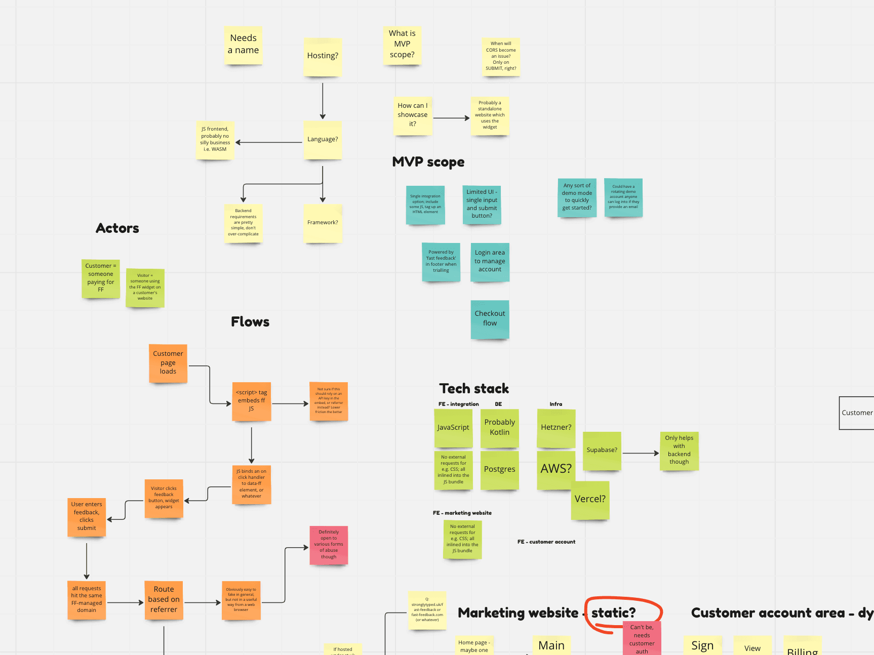
I couldn't completely resist the temptation to cut some code and so at the end of the day created a Spring Boot ‘Hello world’ Kotlin application with a bare bones Feedback API and a JavaScript ‘widget’ amounting to no more than a built-in prompt() dialog. Some other things I was fairly confident in after day one:
- I'd use Supabase for data storage and user authentication, because I'd experimented with it a bit previously and loved what I saw
- I'd use Stripe for payment processing, because I'd used it years prior and had no reason not to again
- I'd use Sendgrid for sending email notifications, because it offered the best free plan of the ones I looked at and I was pretty sure my use-case wouldn't touch the sides of any of them
Day two: build
With a solid day of planning under my belt the first thing I did on day two was change my mind: I realised that I didn't have much of a plan when it came to production hosting, and also couldn't shake the feeling that going all-in on a backend-heavy ecosystem when one of the main things I needed was a frontend widget didn't make sense. I'd done some cursory investigation into Next.js the day before and was Twitter-aware of Vercel but shied away from both due to unfamiliarity and the fact I hadn't written any serious JavaScript in a long time. That changed when I stumbled across the Next.js Subscription Starter template and my mind was made up; it provided such a huge chunk of what I needed that even with the time needed to learn Next, Tailwind, Vercel and refamiliarise myself with the JavaScript ecosystem, I'd surely come out ahead. I spent the rest of the day hacking around cutting out bits of the starter template I knew I wouldn't need and adding a read-only view of a customer's feedback submissions (still submitted via the Spring Boot app at this stage). Mistake number one already in the bag, but a swift course correction and no real harm done.
Day three: organise
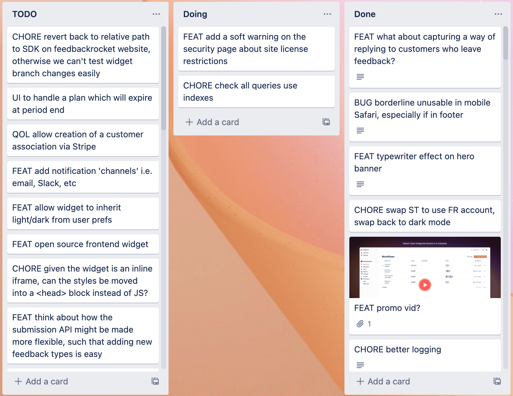
With build underway it was time to organise the chaos. I created a Trello board with three lists: Todo, Doing, Done. I chucked a load of one-line cards in Todo and shuffled them into approximate priority order. I ported the Spring Boot submission API to Next.js and copied over the widget SDK, so from this point on was only working in a single repository until launch.
Days 4-9: more build
I wrote lots of code and fixed lots of bugs. I invested a lot of time into the widget itself. Frontend code has never been my forté, and the added constraint that the widget needs to show up and look good anywhere, on any host page (which might be an inadvertantly hostile environment depending on how it has been styled) and on any device made things especially interesting. The commit messages from this time period don't suggest any more huge one-eighties, but things could've definitely been quicker if I'd known my way around Next.js a little better. There was the odd crippling episode of analysis paralysis over largely inconsequential features and implementation details to contend with too, about which I can offer little advice other than making any decision is better than making no decision.
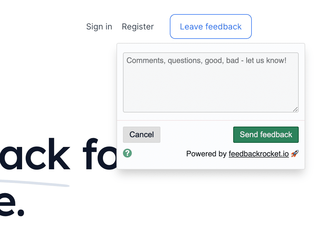
The light themed widget as it currently appears on the live feedback rocket website. The dark theme version is in use on this website.
Day 10: site design
Time to confront the elephant in the room and my perpetual achilles heel when it comes to solo projects: design. I'm hopeless at both user interface and user experience design, and as much as I try and focus for as long as possible on building something rather than worrying about its appearance, there comes a point where I find a lack of design and structure an overwhelming distraction. The Next Subscription Starter template is perfectly pleasant, but the functionality I'd added during the preceding week had started to outgrow it (or more accurately, my inability to grow it). I needed a logo, a website design, and in an ideal world some HTML/CSS I could hack around with rather than write from scratch to build whatever design I ended up with. I'd been looking for a suitable paid-for HTML template on and off during the build so far but hadn't come close to finding anything good enough.
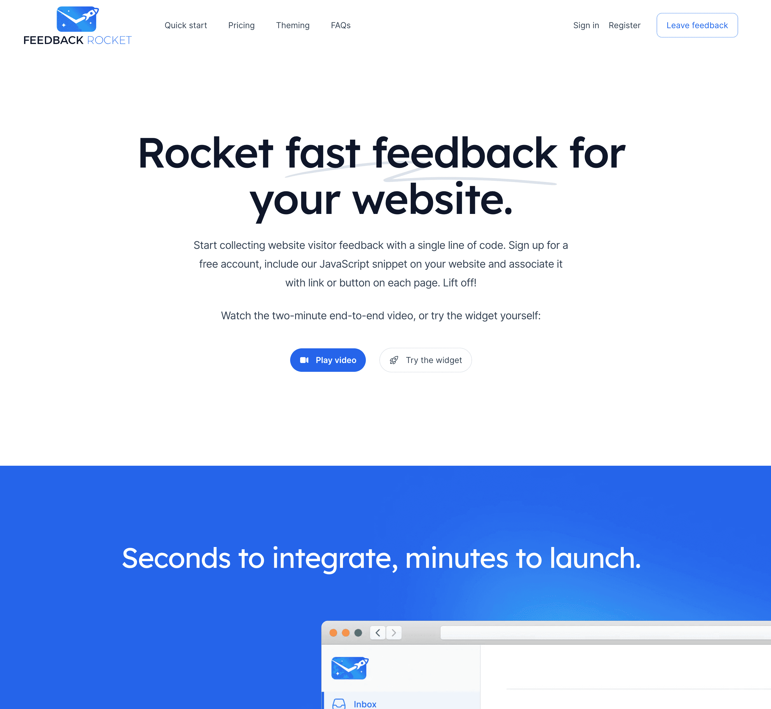
And then I stumbled across Tailwind UI. Wow. This was the match made in heaven I didn't know I needed; not only did it offer a range of pre-built templates but also a rich set of components when exceeding a template's limits, and the components are the most lego-like collection of building blocks I've ever seen. If you've glanced at the range of templates and the feedbackrocket.io website you'll know that I started with the superb Salient, diving into the component goodybag for the logged-in account pages.
You might not consider Tailwind UI cheap, but it represents incredible value for money. If you're in a remotely similar position to me, don't hesitate; just buy it. The value I've already gotten out of the templates, let alone the re-use I'll get from the components and lifetime access makes it absurdly good value. The site you're looking at right now uses it too, as will most if not all of my forthcoming launches this year.
Day 11: logo design
After a fruitless week trying to convince a computer to create a logo for me while I worked through my todo list, I took a punt on fiverr.com after years of contradictory self-enforced snobbery (“it's too cheap to be any good!”) and indignation (“people can't work for that!”) had kept me away. I ended up going with a seller named design_desk based on exceptional reviews and turnaround time, and I love the end result you can see on the site today. I did make a few small tweaks to the final delivery but I'm sure the seller would've made them for me if I'd asked, but in any case since all the source files were provided doing so was trivial. This is my one and only fiverr.com data point at present and I'm sure not all experiences will be this rosey, but I won't hesitate to go back again in future.
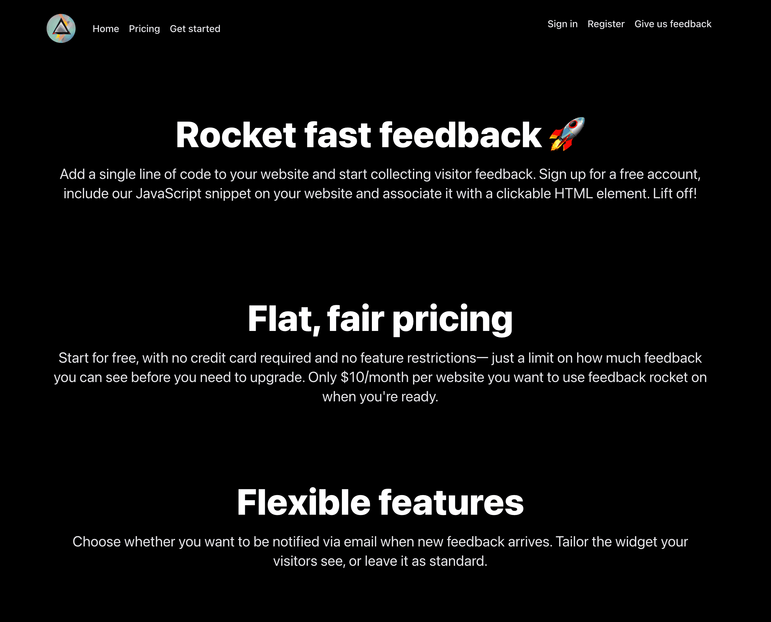
Before and after Tailwind UI and logo integration. The placeholder logo above is one of Stable Diffusion's many creative attempts.
Day 12: beta launch
Bouyed by having a presentable looking website with a proper brand identity I knew I was running out of excuses not to launch, but since this was a Friday I decided instead on a short-lived beta which I'd share with close friends over the weekend. If nothing awful happened when other human beings looked at the site, I resolved to launch on Monday.
Day 15: production
Nothing awful happened when other human beings looked at the site, so I was out of excuses: time to launch! Aside from setting up some live Stripe plans and a new Supabase project, there wasn't a lot to this. I put the site live at around midday with zero fanfare and without announcement, intending to let it marinade for a few days while I gathered my thoughts and made a plan for how to promote it and what to start building next. If there's one thing I'm worse at than design, it's marketing, so I'm braced for this next phase to be the hardest and the most painful as I have to leave my anxieties and introversion behind, make peace with my fear of failure, and start actively trying to promote the product.
Build thoughts: the good
- Vercel, Next.js and their satellite ecosystems are awesome for shipping software. I can't think of a more streamlined way of getting from idea to production in the case where you don't have any infrastructure you can leverage already, and even in those cases I think you'd be hard pushed to beat the ‘just works’ nature of Vercel. Some of the ideas in Next.js are excellent as is their execution, too
- I'm delighted with the appearance of the site thanks to Tailwind UI and fiverr
- Stripe has come a long way in the years since I've used it and the low-code offerings meant I had to write a lot less account/plan management code this time around
- Supabase makes user auth and data storage virtually painless
Build thoughts: the bad
- Had I known what I was doing with React, Next, Vercel, Tailwind and friends from the get go, the build could've definitely been quicker
- I lost time agonising about two different ways the widget could be configured by the end user which ultimately didn't really matter
- I put up with the Supabase Auth UI React login/register components (which are used by the Next Subscription Starter template) long after I knew they weren't a great fit for my use case. They're great for bootstrapping and offer a lot of auth-related functionality out of the box, so I assumed - wrongly in the end - that not using them would prove much slower than using and working around them
- I flew in the face of the convential wisdom to use a boring, familiar tech stack in favour of something new and shiny - but in truth, this belongs in the good and the bad, since it worked out well in the end
Up next: promotion
Plan to production complete, so now the real work begins. Wish me luck! 🚀
